Your wake time
Read from Apple Health. The whole curve anchors here - peaks and dips are spaced relative to when your day actually began, not a generic seven a.m.
Energy Curve · 24-hour energy prediction
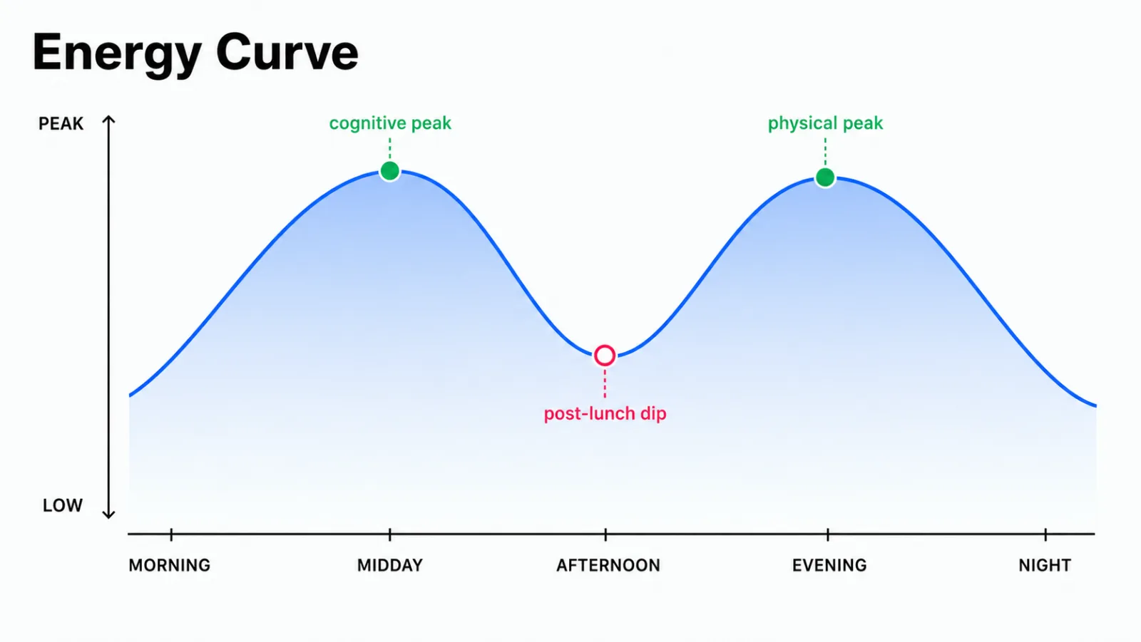
A daily energy levels chart - your predicted 24-hour curve. Where the morning window for thinking opens. When the afternoon dip arrives. Why physical capacity climbs again at four. Drawn from your Apple Watch sleep and wake data, plotted against a model of human energy that's been studied since 1982.
Part of premium. Core features free.
Not a feeling. The underlying rhythm - drawn as a curve, so you can see where to put what.
A morning window for thinking. An afternoon window for moving. A dip in between that's not a personal failing.
You sit down to a task you were sharp for at ten and the words slide off. The coffee doesn't catch. It feels like a discipline problem. It isn't.
The dip is a real biological event - the trough of a twelve-hour secondary oscillator riding on top of accumulating sleep pressure. It happens whether or not you had lunch. It happens to people who skip lunch entirely. The phrase post-lunch dip is a misnomer; the body would have dipped anyway.
The Energy Curve draws the whole day this way - not as a feeling, but as a predictable shape. A morning rise into a cognitive peak. The afternoon dip. A second climb into a late-afternoon physical peak. The gradual evening decline. The deep overnight trough. Once you can see the shape, the day starts to organize itself around it.

The cognitive peak and the physical peak almost never land at the same hour. Executive function tends to peak in the late morning. It covers work such as weighing trade-offs, writing a difficult email, or debugging messy code. This peak comes before the body's core temperature has climbed.
Muscle strength and reaction time track with core temperature. So do lung function and nerve conduction. Those peak hours later, in the late afternoon. A runner's interval session and an analyst's deepest spreadsheet hour are not the same body, even though they share an owner.
The curve shows both, so you can put the right thing in the right window. The hard write at ten. The walk at four. The dip in between, treated as a fact instead of a verdict.
iPhone + Apple Watch. Part of premium.
The Energy Curve is built on a model of human alertness that's been refined for more than forty years. Here's what's under it, and what it isn't.
Alexander Borbély published the two-process model of sleep regulation in 1982. It has guided chronobiology research since then. It says, roughly, that how alert you feel at any moment is the result of two systems running at the same time.
Process C is the circadian rhythm. It is a clock-like cycle in body temperature, hormones, and alertness. It continues whether you slept or not. It runs on a 24-hour cycle with a secondary 12-hour wave layered on top, which is what creates the W-shape rather than a single smooth arc.
Process S is sleep pressure - the accumulating drive for sleep that builds linearly across the day and dissipates only when you sleep. The longer you've been awake, the heavier it weighs on the alertness side of the equation.
What you feel in the moment is the interaction of the two. The morning cognitive peak is high Process C combined with low Process S. The afternoon dip is the secondary Process C trough meeting rising Process S. The evening lift is the secondary Process C peak, dampened by the sleep pressure that's now accumulated over twelve hours.

Apple Watch records the inputs. Body Insights reads them and draws the predicted shape. We don't measure energy directly - there is no such sensor. We model the rhythm using inputs your watch already collects.
Read from Apple Health. The whole curve anchors here - peaks and dips are spaced relative to when your day actually began, not a generic seven a.m.
Duration, stage proportions, fragmentation. A shorter or more broken night raises the sleep-pressure side of the equation and dampens the height of the peaks.
A primary 24-hour oscillator and a secondary 12-hour oscillator, layered. The secondary wave is what creates the W rather than a single smooth arc.
A linear climb across the awake hours, dissipating overnight. This is what dampens the evening peak relative to the morning one.
The two peaks appear as separate windows because they reflect different physiology. Executive function rises before core temperature. Muscle output tracks it.
A marker on the curve for the current time, so you can see whether you're in a window, in the dip, or on the way down - without doing math.
Body Insights has two energy views that look related and do different jobs.
The Energy Module is the day-to-day picture - today's body battery, the morning recommendation, whether the week is trending toward a crash. It answers the question what does today have in it.
The Energy Curve is the 24-hour shape underneath. It answers the question given the energy I have today, when should I put what. Same data feeding both. Different questions.
Most people read the module every morning. They check the curve when planning the harder parts of the day. That might be a meeting, a walk, or rest that needs protection.
The shape doesn't go away in ME/CFS, long COVID, perimenopause, fibromyalgia, or post-viral recovery. The rhythm is structural - driven by light, temperature, and the clock genes that don't stop running because you're tired.
What changes is the height of the peaks. On a low day the curve flattens - same W, lower ceiling. The cognitive window narrows; the physical window may close almost entirely. The dip can feel cavernous.
That's still useful information. Knowing the shape means putting the one cognitive task you have to do at ten instead of at two. It means not scheduling the appointment that requires you to be sharp into the dip. It means letting the dip be a planned pause instead of a daily ambush.
The honest comparison.
| Apple Health | Oura / Whoop | Generic chronotype quiz | Body Insights | |
|---|---|---|---|---|
| 24-hour predicted curve | No | Partial | No | Yes |
| Anchored to your actual wake time | No | No | No (label only) | Yes |
| Cognitive and physical peaks separated | No | No | No | Yes |
| Two-process model under the hood | No | No | No | Yes |
| Tuned for variable baselines | No | No (athlete-default) | No | Yes |
| Subscription | None | $6-30 / month | Free | Premium tier |
| Extra hardware | None | Ring or strap | None | None |
Chronotype quizzes give you a label - lark, owl, hummingbird - and stop there. The Energy Curve gives you a shape, anchored to when your day actually starts, that's different on a low-sleep day than on a rested one. The label was never the useful part.
A visualization of your predicted alertness, focus, and physical capacity across a 24-hour day. Body Insights draws a W-shaped curve from the two-process model. It shows a morning rise, cognitive peak, and post-lunch dip. A physical peak and gradual evening decline follow.
Yes. It's a documented circadian phenomenon that shows up even in people who skip lunch. It reflects a twelve-hour secondary oscillator trough combined with rising sleep pressure. It is not a personal failing.
Executive function tends to peak before the body's core temperature. Muscle strength and reaction time track with core temperature. Same body, two different windows, hours apart.
Predicted. The curve is the shape your day is likely to take, drawn from your wake time and recent baseline. For a moment-by-moment read of today's available energy, see the Energy Module.
Yes. The rhythm is structural - it doesn't disappear with chronic illness. What changes is the height of the peaks. The shape remains useful for placing tasks.
The Energy Curve is part of the premium tier. Core energy features - the daily body battery and morning recommendation - are free.
On-device. No account. No data sold. Ever.

Predicted from your Apple Watch sleep and wake data. Part of the premium tier; core features free.